
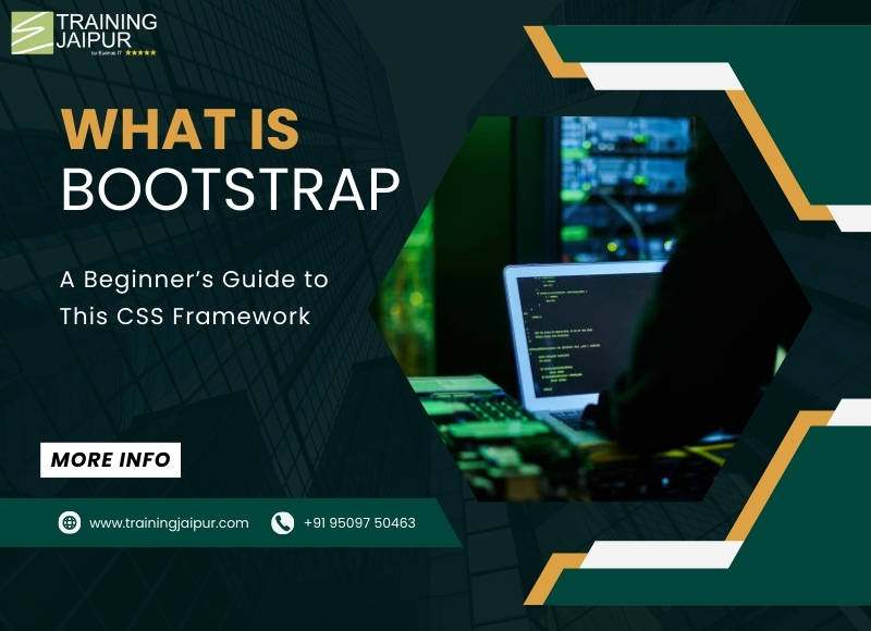
If you are new to web development, you might have heard the term Bootstrap. But what exactly is it?
Whether you are a beginner or an experienced developer, Bootstrap simplifies web design and saves time by reducing the need to write custom CSS and JavaScript. It is widely used because it is mobile-first, meaning websites automatically adjust to different screen sizes without extra effort.
1. Understanding Bootstrap – The Basics
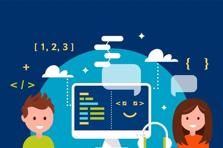
Bootstrap is a popular CSS framework that helps developers create modern, responsive websites quickly. It provides a collection of ready-to-use CSS styles, JavaScript components, and a powerful grid system to design web pages efficiently. Developed by Twitter, Bootstrap makes web development easier by offering a pre-designed structure.
2. Exploring the Bootstrap Framework
The Bootstrap framework is a set of tools that provide a foundation for building attractive websites. It includes:
a) CSS Styles
Bootstrap comes with pre-designed CSS classes that help you style buttons, forms, tables, alerts, and more without writing lengthy code.
b) JavaScript Components
Bootstrap includes built-in JavaScript features like modals, carousels, tooltips, and dropdowns, making your website interactive without writing extra code.
c) Grid System
One of the most powerful features of Bootstrap is its grid system, which helps developers create flexible and responsive layouts.
d) Customization
Even though Bootstrap has default styles, you can easily customize it using CSS and SCSS (Sass) to match your project’s design.
3. Bootstrap for Beginners: A Step-by-Step Guide
Bootstrap is a popular framework that helps you create beautiful and responsive websites easily. It provides pre-designed styles and components that you can use without writing a lot of CSS or JavaScript.
If you’re new to Bootstrap, follow these steps to get started:
1. Using Bootstrap CDN (Content Delivery Network)
A CDN is an online server that stores Bootstrap files, allowing you to use them directly without downloading anything. This is the easiest way to start with Bootstrap.
Steps to use Bootstrap CDN:
-
Open your website’s HTML file using a code editor (such as Notepad++, VS Code, or Sublime Text).
-
In the head section of your HTML file, you need to insert the Bootstrap CDN link. This will load Bootstrap styles automatically when your webpage runs.
-
Save the file.
-
Open the file in a web browser (such as Chrome or Firefox). You will now see that Bootstrap styles are applied to your webpage.
2. Downloading Bootstrap Locally
If you want to have full control over Bootstrap files and work offline, you can download them to your computer.
Steps to download and use Bootstrap locally:
-
Visit the official Bootstrap website: getbootstrap.com.
-
Look for the download option and click on it to download the Bootstrap files.
-
Once the download is complete, extract the files (they usually come in a ZIP folder).
-
Copy the extracted Bootstrap folder and place it inside your project folder.
-
Open your HTML file and manually link the Bootstrap CSS and JavaScript files.
-
Save your HTML file and reload it in your browser. You will now see Bootstrap styles applied.
Which Method Should You Choose?
-
If you are a beginner or want a quick setup, use the Bootstrap CDN because it’s easy and requires no downloads.
-
If you are working on a professional project and need more control, download Bootstrap locally.
4. The Bootstrap Grid System – Making Layouts Easy
Bootstrap's grid system is a powerful tool that helps in designing flexible and responsive web layouts. It allows developers to structure a webpage into sections that adjust automatically to different screen sizes, making websites look great on all devices.
1. How the Grid System Works
Bootstrap follows a 12-column layout system. This means that every webpage is divided into 12 equal parts (columns). You can use these columns to organize content in different ways.
For example, you can:
-
Use all 12 columns for one full-width section.
-
Split them into two equal sections (6 columns each).
-
Create a three-part layout (4 columns each).
-
Use a combination like 3+3+6, 2+8+2, or any other arrangement, as long as the total is 12.
This system allows flexibility in arranging text, images, videos, or any other content.
2. Creating Responsive Layouts
One of the biggest advantages of Bootstrap’s grid system is its automatic responsiveness. This means that content adjusts itself based on the screen size.
How It Works:
-
On large screens (like desktops), elements are arranged in multiple columns.
-
On medium screens (like tablets), columns might shrink or stack differently.
-
On small screens (like smartphones), content usually stacks vertically for better readability.
Since Bootstrap handles these adjustments automatically, developers don’t have to write extra code for different devices. This makes it easier to create professional-looking websites without deep technical knowledge.
Benefits of the Bootstrap Grid System:
✅ Saves Time: No need to design separate layouts for different devices.
✅ Flexible: Easily adjust column sizes to fit content properly.
✅ User-Friendly: Makes websites look neat and organized.
✅ Responsive: Works well on desktops, tablets, and smartphones without extra effort.
By using Bootstrap’s grid system, web designers and developers can create clean, structured, and mobile-friendly websites quickly and efficiently.
5. Bootstrap 5 – The Latest Version
Bootstrap 5 is the latest version of the framework, offering new features and improvements over Bootstrap 4.
-
No jQuery dependency – Bootstrap 5 relies on pure JavaScript.
-
Improved Grid System – More flexibility and new utility classes.
-
New Components – Like offcanvas navigation.
-
Enhanced Forms – Better styling and validation.
Learning Bootstrap
Bootstrap is a tool that helps you create websites quickly and easily. It comes with ready-made designs, a grid system to organize your page, and useful styles for buttons, forms, and more. With Bootstrap, you can make websites that look great on all devices, from mobiles to desktops.
You can learn Bootstrap at Training Jaipur, where experts will teach you step by step. With practical lessons and real projects, you will gain the skills to build modern websites. Join now to start your journey in web development and create amazing websites with ease
Conclusion
Bootstrap is an essential tool for developers looking to build modern, responsive websites efficiently. Its extensive collection of pre-designed styles and components helps save time and effort while ensuring consistency in design. The powerful grid system makes layout creation straightforward, and its mobile-first approach guarantees a seamless experience across all devices.
With the latest Bootstrap 5 improvements, web development has become even more flexible and efficient. Whether you're a beginner or an experienced developer, mastering Bootstrap will give you the tools to create visually appealing, fully functional websites with ease.


Comment